Sunday, September 28, 2014

Ello For Dummies

A new social network is gaining traction.  It's called Ello.

It's still in beta, so you need an invitation.  Get one and sign-in.  http://ello.co

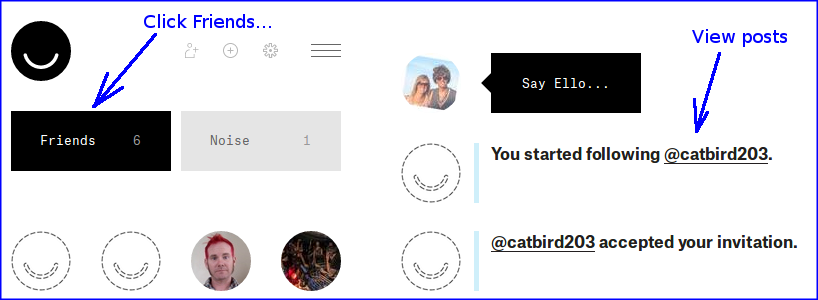
Here are a dozen basic instructions on how to use ello.  It's enough to get started. (Click photos to enlarge.)   And there are more references listed at the bottom.

Enjoy...


Go to main page

Set profile photo


Set header photo


Post a comment


Post a photo


Post comment or photo to another person


Delete a post or photo


Find people by search


Find people by follows


Find people by posts


Follow a person


Change classification as friend or noise


View posts by all people classified as friends


View posts by all people classified as noise


Block spam


Hide and expose the left side panel


Log out


For more information, here are more detailed tutorials I like...


Thursday, August 14, 2014

BMIR on Mobile Devices

Updated for 2015...

BMIR (Burning Man Information Radio) is the official radio station of the annual Burning Man event.  BMIR broadcasts at the event on 94.5 FM, and streams over the internet year-round to listeners worldwide.

There are several ways to listen, on mobile devices and computers...

BMIR's Android App

Since 2011:  https://play.google.com/store/apps/details?id=org.bmir.mobile.android.player


BMIR's iPhone/iPad App

Since 2014:  https://itunes.apple.com/us/app/bmir-player/id808847231?ls=1&mt=8


iHeartRadio for all mobile devices

Coming soon...   http://news.iheart.com/features/get-the-iheartradio-app-240/ 


Computer browsers


You can also listen on a computer: http://www.bmir.org
The Flowplayer should start playing automatically, or you can click on the ListenNow link.


Tuesday, May 27, 2014

Determining web service health by inspecting JSON response data in an Uptime Plugin.

Abstract


This article demonstrates how to write a Plugin for Uptime which:
- analyzes the contents of a JSON response payload response from a target web service, and
- uses the JSON information to determine and report health of the service to Uptime.

A sample plugin is provided.  The sample queries the health of the well-known Google Geocoding REST service by inspecting the contents of its JSON response.


Background


Uptime is an application which continuously evaluates the health of web services.  https://github.com/fzaninotto/uptime

To determine the health of a service, Uptime periodically issues web requests to the target service.

In its simplest form, Uptime declares the service is up if a successful response is received from the service.  Otherwise, it declares the service is down.

Uptime also provides a plugin interface which allows Uptime to be extended to perform custom operations.  This article exploits the plugin interface to inspect the contents of the JSON response from the target web service.


Motivation


I wanted to use Uptime to report the health of a custom web service based upon information received in a JSON response provided by the service.

Instead of relying exclusively on receipt of a 200 response, I also wanted Uptime to analyze the contents of the JSON response payload for my custom web services.  Basically, I wanted to read the contents of the JSON response and look for specific key words and associated values "pass" or "fail".

The sample plugin described below shows how to inspect the response JSON.


Uptime setup


Ubuntu:  I set up a 32-bit machine with Ubuntu Linux 12.04.

http://releases.ubuntu.com/12.04/

As root, I installed and set up the following:

Mongo DB:  http://docs.mongodb.org/manual/tutorial/install-mongodb-on-debian/

Mongo User/Password: Set a database user name and password into Mongo:

/root> mongo
> use uptime
> db.addUser('myUser','myPassword');
> exit

Git:  apt-get -y install git

G++:  apg-get -y install g++  (note: g++ was required for 'npm install')

As user, 

Node.js:  I fetched and unzipped the latest Node JS, and added it to user and root paths.

http://nodejs.org/download/

Uptime:

docs:  https://github.com/fzaninotto/uptime   Scroll down to "Installing Uptime"

You will get to the important command:  git clone git://github.com/fzaninotto/uptime.git

In my case, uptime was installed to directory /home/user/uptime/...

Set the mongo database user name and password into Uptime:

/home/user> vi uptime/config/default.yaml

user:     myUser
  password: myPassword

Start uptime

/home/user> cd uptime
/home/user/uptime> node app.js


Verification


Browse http://<your_hostname>:8082/  Verify "welcome to uptime"

Click to create your first check.  Verify Uptime correctly monitors the target.

Uptime is now set up properly.  It is ready to install the sample plugin.

Note:  Henceforth, all commands are issued as user.


Hello World Plugin


I created a hello world plugin to get started.

As a sample, the plugin is designed to evaluate the health of a well known REST service, the Google Geocoding Service.

Uptime sends a web request to the service.  You specify the Google URL in the Uptime Check configuration screen (see below).

When a response comes back from Google, Uptime passes each JSON response to the plugin.  The plugin reads and evaluates the contents of the response, and reports results back to Uptime.  In this sample, it passes if it sees "status":"OK".


Install the plugin


Fetch the sample hello world plugin here:

https://sites.google.com/site/sagitt001/uptime/uptime.plugin.helloworld.zip?attredirects=0&d=1

Unzip it to create

/home/user/uptime/plugins/helloworld/...

Edit the Uptime config file, and add the plugin name:

/home/user/uptime> vi config/default.yaml

plugins:
 - ./plugins/helloworld   <--- add this line
 - ./plugins/console
 - ./plugins/patternMatcher

Inspect the plugin


There are three files in directory plugins/helloworld/...   That's all it takes (though you can add more if you like).

jquery.autoresize.js 

This was copied unchanged from the httpOptions plugin.

It assists with presentation of the user configuration screen in Uptime.

_detailsEdit.ejs

This file is copied from httpOptions and slightly modified.

It also assists with presentation of the user configuration screen.

index.js

This file was adapted from a sample plugin developed by Alexander O'Donovan-Jones on github (see acknowledgements)

It contains two interesting sections.

exports.initWebApp.  This section assists with presentation of the user config screen.

exports.initMonitor.  This section parses the JSON response object according to user specified options.  (This is most likely the section you will change heavily to evaluate your own JSON response)


How to run it


Restart Uptime if it was still running.

Browse to your uptime.

Click tab Checks-> Create Check.  Type the following values.  Accept defaults for the rest.  Click 'Save' when done.

URL:  http://maps.googleapis.com/maps/api/geocode/json?address=1600+Amphitheatre+Parkway,+Mountain+View,+CA&sensor=false
Type:  http
Name:  Google Geocoding
Poling interval: 15 s

Edit the Check again.  Click tab Checks-> Click Google Geocoding-> Click button Edit.  A new text box will appear: Hello World Options.  Type the following values on two lines, with no quotes (YAML format).  Click 'Save' when done.

Hello World Options:

geocode: google
trace: true

Restart Uptime again.

I like to pipe results to a log file, so that I can review it easily.

/home/user/uptime> node app.js > /tmp/uptime.log

I also like to monitor live progress in another command-prompt terminal

/home/user/uptime> tail -f /tmp/uptime.log

Results:


Every 15 seconds or so, the log should display messages from the JSON results analysis code in index.js.  Examples:

Evidence that user options are properly set in the config, and properly presented to the plugin:

on.PollerPolled: Entry.
on.PollerPolled: options: { trace: true, geocode: 'google' }
on.PollerPolled: t=true
on.PollerPolled: geocode=google
on.PollerPolled: url=http://maps.googleapis.com/maps/api/geocode/json?address=1600+Amphitheatre+Parkway,+Mountain+View,+CA&sensor=false

Evidence that the JSON response from Google Geocoding has been properly received and parsed.

checkGoogleGeocode: Entry. body: { results:
  [ { address_components: [Object],
      formatted_address: '1600 Amphitheatre Parkway, Mountain View, CA 94043, USA',
      geometry: [Object],
      types: [Object] } ],
 status: 'OK' }
checkGoogleGeocode: status: 'OK'
checkGoogleGeocode: Exit. Success.

And, drumroll please, Uptime should display a green indication that the service is up.

Variations


Add more javascript to index.js checkGoogleGeocoding().  Inspect other values in the JSON.  Restart Uptime.  Verify.

Edit the plugin configuration.  Disable verbose tracing  trace: false  Save.  Restart Uptime. Verify fewer log messages.

Play with it.  Learn how it works.

Conclusion


The sample hello world plugin demonstrates how to query a REST service and evaluate the contents of the JSON response, using a well-known service provided by Google, Inc.

Once this works, you have all the secrets you need to query your own REST services and evaluate their JSON responses.  Change the URL in the Uptime Check configuration.  Then modify index.js to evaluate your own JSON responses.


Be nice


Don't bash the Google Geocoding service continuously.  Stop uptime or delete the plugin when you are not studying it.


Acknowledgements


Many thanks to Francois Zaninotto for creating, publishing, and supporting Uptime.

https://github.com/fzaninotto/uptime

Many thanks to Alexander O'Donovan-Jones for creating and sharing a plugin named jsonValidator.

https://github.com/aodj/uptime/blob/master/plugins/jsonValidator

And thanks to Google, Inc for providing the Google Geocoding service used in this sample.

https://developers.google.com/maps/documentation/geocoding/

Saturday, March 8, 2014

Chart.js As A Service

Abstract


This article shows how to quickly and easily present continuous test results in a bar chart using ChartJS.

Motivation


I recently helped our IT department debug and fix a networking problem in a set of lab test machines.  Over several weeks, I wrote test scripts which continuously checked the status of the networking problem.

As I steadily grew the complexity of the scripts, I found myself spending more and more time answering questions from the IT team, manually interpreting the results in my log files.

When it hit my threshold of pain, I searched and found an easy way to present the results visually.  This way, the IT team could browse and view results themselves, on-demand, without bothering me.  Score!

Technology Search


Fixing the networking problem was an ad-hoc effort, so I did not have a formal continuous-test framework with fancy dashboard where I could post the data.  I needed to set up my own.

I researched a few data warehouse and data mining products and services, but they were too complicated for my simple needs.

Eventually, I happened upon Chart.js.  I hadn't known about it or used it before.  It's great.

What is Chart.js?


Chart.js is a small javascript library file.  It is available as a free opensource project under the MIT license at http://www.chartjs.org/

To use it, you write some HTML and javascript, provide your data in JSON format, and ChartJS will render your data in a bar chart or other type of graph which you specify.

All you need is a little DIY scripting, an apache web server, and a browser.

References


I learned everything I needed to know from the official docs:
http://www.chartjs.org/docs/

And I found a perfect tutorial for my needs:
http://www.techrepublic.com/blog/software-engineer/chartjs-library-simplifies-adding-charts-to-web-applications/

Getting started


I recommend you download Chart.js and replicate the examples in the tutorial.  Figure out how it works, and create a chart you like in an HTML file with canned data.   Then you can move on to updating the data automatically...

Overview


Here is how it all works...


Now let's put the pieces together...

JSON test results


The first thing I did was enhance my test scripting to output its results in JSON format.  It was already logging these numbers; the change was to also write them to a new JSON file.

For my purposes, I stored data in this format (only three samples shown for simplicity, and sanitized for privacy):

[
 { "time":"2014-0306-1801", "rc":{ "ok":11, "error0":0, "error1":0 } },
 { "time":"2014-0306-1935", "rc":{ "ok":8,  "error0":2, "error1":1 } },
 { "time":"2014-0306-2029", "rc":{ "ok":11, "error0":0, "error1":0 } },

To bootstrap things, I manually created a flat file named results.json.  I typed the opening square bracket for a JSON list, and saved the file.

Each time my test scripting finished running a test cycle, it appended a new line to the bottom of the file.  My test scripts were written in the bash language, so my code looked like this.

JSON_STATS="  { \"time\":\"${DATE_NOW}\", \"rc\":{ \"ok\":${OK}, \"error0\":${ERROR0},  \"error1\":${ERROR1} } },"

    echo "${JSON_STATS}" >> ${JSON_FILE}

You can do this with whatever scripting language you like, and I'm sure it's easier than bash.

Note that I *appended* the results to the file.  This preserves history of earlier runs.

Also, JSON afficiandos will note that each line ends with a comma, and there is no closing square bracket to terminate the JSON list. In its present form, this means the file contents are not correctly-parseable JSON.  Not to worry, this was intentional to allow easy appending.  It is handled gracefully in the next step...


Conversion from JSON to HTML


Each time my test script appends new results to the JSON file, it calls a python program I wrote to convert the data from JSON to HTML.

There are two pieces of this: swizzling the results data for use by Chart.js, and creation of the HTML file...

Swizzle the JSON data

The output from my testcase scripting is organized according to time.  That is, each line contains a timestamp along with results for that period of time.

However, for a bar chart, Chart.js requires the data to be organized differently.  It requires a list of labels to be shown along the bottom of the chart, along with lists of data for each bar on the chart.

To do this conversion, the python program opened and read file results.json and swizzled the data.

To accommodate the fact that my results.json file does not contain correctly-parseable JSON, the python script first read in all the lines of the file in string form, deleted the trailing comma, and appended a closing square bracket.  Voila, instant parseable JSON.

It handed the string to simplejson which parsed it and converted it to a list of objects.

jsonList = simplejson.loads( jsonString )

Then it swizzled the data organization as required by Chart.js.  Using the data in my previous example, it looked like this after conversion:

timeList = [ "2014-0306-1801", "2014-0306-1935", "2014-0306-2029" ]
okList = [ 11, 8, 11 ]
error0List = [  0, 2, 0 ]
error1List = [ 0, 1, 0 ]

Also, since my application was designed to present the most recent results of continuously-running tests, I chose to find and convert only the most recent data points, rather than everything in the history.  (This example shows three; my real program showed 32.)

The same python program then created an HTML file named results.html.

Create HTML file

After a bit of experimenting with Chart.js using a manually-created HTML file, I settled on a design for a bar chart which I liked.  I then converted the HTML file to be used as a template by replacing each list of data with a unique uppercase string.

That is, I removed the label list data and inserted the string TIME_LIST.  I removed each data list in the datasets section, and replaced them with OK_LIST, ERROR_0_LIST, and ERROR_1_LIST.

The data portion of my HTML template file looked like this:

var data = {
"labels": TIME_LIST,
"datasets": [
{
"fillColor": "rgba(0,255,0,1)",
"strokeColor": "rgba(0,255,0,1)",
"data": OK_LIST
},
{
"fillColor": "rgba(255,0,0,1)",
"strokeColor": "rgba(255,0,0,1)",
"data": ERROR_0_LIST
},
{
"fillColor": "rgba(128,128,256,1)",
"strokeColor": "rgba(128,128,256,1)",
"data": ERROR_1_LIST
}
]
}

To convert the uppercase strings, the python program read the entire template file to a string (named templateString) and replaced each uppercase string with the real data.  My python code looked like this:

    templateString = templateString.replace("TIME_LIST",    simplejson.dumps(timeList))
    templateString = templateString.replace("OK_LIST",      simplejson.dumps(okList))
    templateString = templateString.replace("ERROR_0_LIST", simplejson.dumps(error0List))
    templateString = templateString.replace("ERROR_1_LIST", simplejson.dumps(error1List))

The new HTML file was ready. The python program saved the new file as results.html.


Publishing on apache web server


After calling the python program to convert results.json to results.html, the last step for my bash test script was to transfer the HTML file to an apache web server.  Each time it ran, it replaced the previous file on the web server.

Because this was on a private internal network, I transferred the file using linux utilities sshpass and scp.

sshpass -p${PASWORD} scp results.html ${USER}@${HOSTNAME}:/var/www/

Monitoring results


My partners in the IT team were now able to browse to the results.html file and see current results whenever they liked.  They could tell how well any fixes they applied overnight were working througout the next day, and I was not required lose sleep to support them.  Yay.

Here is a colorful example showing lots of errors (note: I changed the contents of the chart frequently during the debug cycle; this version of the chart only contained two bar columns, red and green).


Bells and whistles


After everything was working, I added a good old 'refresh' tag to the HTML head section.  With this, the observer could leave the web page up in his browser, and it would refresh itself every two minutes without having to manually click refresh.  Bonus!

<META http-equiv="refresh" content="120">

Closing


That's all there is.

It may seem complicated described in so many words, but its' really not.  After several false starts with other technologies, developing all of this took me less than four hours, all told.

My IT team was delighted with it.  I saved myself time by developing it.  And I can use the system for other applications in the future.  Success!

Take a look at Chart.js.  You'll like it.

PS: Many thanks to the developers of Chart.js, and to the tutorial author at techrepublic.com


Sunday, June 30, 2013

How to suppress Categories in Gmail

Last month, Google deployed a new feature in Gmail which automatically categorizes your emails as social, promotions, updates, and forums.  I find it annoying extra clutter.  It provides no value to me.  It's catagorizations are usually wrong.  It smacks of Big Brother.  And there is no button to turn it off.

After a month of ignoring it, I started searching.   I found an easy solution.  It's a one-time task.  Create a filter which captures all your email, and set the category to 'personal'.  Be sure to check the box to apply the filter to all existing emails too.  Then wait.  Mine took about 15 seconds to update all my archived emails.

The complete instructions were posted by wdurham on June 2 at the bottom of this page:
    http://productforums.google.com/forum/#!topic/gmail/MDWXUKCHrPw%5B1-25-false%5D

All my current emails are now un-categorized, future emails will not be categorized, and the extra clutter is gone.  Thanks wdurham.

Friday, June 28, 2013

Remote Desktop on Linux

I *finally* discovered a quick, easy, and reliable way to access the desktop of remote linux machines.  It's called XRDP.

I've been using linux laptops exclusively since 2001.  And most of my desktop and server machines have been linux since years before that.  But for various reasons, I have never found a good way to access the desktop GUI view remotely.  SSH command-line is my friend, but sometimes you just need a good GUI.  I finally found it.

And it works with Ubuntu linux servers presenting either the good-old gnome desktop (ie gnome-session-fallback) or Unity.

Here's what I did...

Summary

On both machines:  Ubuntu 12.04
On the server:  xrdp
On the client:  remmina

Minimum Setup


Server-side

sudo apt-get -y install xrdp

Client-side

Applications-> Internet-> Remmina Remote Desktop Client

Connection-> New->
Name: <your server's name, nickname, or whatever you like>
Protocol: RDP Remote Desktop Protocol
Server: <your server hostname or IP>
User Name: <account user name on your server>
Password:  <******>
Save

Double-click the connection.  It connects.  Say yay.

Server-side Tweaks


If you prefer the gnome desktop (instead of Unity), and have already installed gnome-session-fallback on your server machine, you can access it using xrdp and remmina with one easy tweak...

On the server machine, sign-in as your user account (ie, not root), open a command-prompt, go to your home directory, and create a new hidden file named .xsession

/home/username> echo "gnome-session --session=gnome-fallback" > .xsession

The next time you connect to the GUI desktop using Remmina, you will get the gnome desktop.

To revert, simply delete file /home/username/.xsession


To speed up repaint performance over slow internet connections, I switch the server desktop background from a pretty image to single color.

On the server machine, right-click the desktop background-> tab Appearance-> dropdown Colors & Gradients-> Click the solid color block (no gradients)-> then select a pleasing color.

Client-side Tweaks


I like a remote desktop window to be smaller than my screen size, so that I can see other windows and navigate easily.

On your linux client machine, in the Remmina app, right-click the connection-> Edit

Resolution-> Custom-> dropdown select a resolution that fits.

In the same dialog, you can also tweak the colors to look better.

Bonus

The XRDP service on the linux servers can also be accessed well from Windows clients (using the Microsoft Remote Desktop client), and Mac clients (using Microsoft's Remote Desktop Connection Client for Mac).

Try it.

Tuesday, December 11, 2012

How to plot points on a map using Google Fusion Tables


This is an introductory tutorial on how to plot points on an online map using Google's experimental Fusion Tables service.

To illustrate the procedure, I will plot some real data.  Some friends of mine recently hosted a fun bicycling contest called the 'Coffeeneuring Challenge'.  The contest is over, the results are in, and I plotted the name of each participant on a map, along with their location, and a link to their blog if available.  This article explains how I did it.

This tutorial is presented in two parts.  This first very basic section will create a CSV file, upload it to Fusion Tables, tweak a group of settings, and publish a URL Link.   The second section will enhance the map to make it more useful.

Prereqs

You need a Google account in order to use the Fusion Table service.

Part 1.  Basic Map


Create CSV file


The results of the bicycling contest were published here:  http://chasingmailboxes.com/2012/12/06/coffeeneuring-challenge-winners-and-honorable-mentions/

I scrolled down about halfway through the story and found the list of participants.  For my first experiment, I started with the first three participants from the list:
    Bill A. the ultimate coffeeneur. Portland, Oregon*
    Crystal B. Aesthetics of Everywhere. (team with Adam) Washington, D.C.
    Dan B. Pittsburgh, Pennsylvania

I manually created a CSV file on my computer using a text editor, and rearranged excerpts of the data to look like this:

    Name,           Location
    "Bill A.",      "Portland, OR"
    "Crystal B.",   "Washington, DC"
    "Dan B.",       "Pittsburgh, PA"

Then I removed all extra whitespace in the file (except that between quotes) and saved it on my computer.

Name,Location
"Bill A.","Portland, OR"
"Crystal B.","Washington, DC"
"Dan B.","Pittsburgh, PA"

To recreate my map, you should create a file with the same contents.

Create Fusion Table


Next, start your browser, go here: https://drive.google.com/ and sign in with your Google account.  In the upper left, click the red button 'Create' -> More -> Fusion Table (experimental).


Click 'Choose File', navigate to your CSV file and upload it.  Click ok-> Next-> Finish.


Your data will now appear in a Fusion Table:


Let's change the settings of the 'Locations' column from being interpreted as text to being interpretated as a map location.  Click the small pulldown arrow adjacent to 'Locations'-> Change-> Type-> Location.   Wait a minute for it to complete.


Add a map to the table.
Click the small plus sign adjacent to tab 'Cards 1'-> Add Map


Wait a minute, and the new map appears.  Notice that there are three small red dots on the map, corresponding to the three cities listed in our CSV file.


Say yay.  We created a map.

Tweak: Let's make the points more visible.  Click the small pulldown arrow adjacent to tab 'Map 1'-> Change map styles -> select large blue icon-> Save.   Wait for the map to refresh.  Much nicer.


Publish the map.  This takes several steps to make the map public and then get the URL link.
Click the pulldown arrow adjacent to tab 'Map 1' again-> Publish


Click 'Change Visibility'


At 'Who has access', click 'Change'


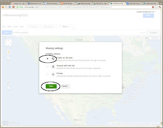
Click 'Public on the web'-> Save


Save the URL link which now appears.  This link can be shared with others.


Test:  Start another browser window and go to that URL.  You will see a nice map.  Viewers can scroll around and click on the placemarks, but they can't edit it.  Cool.


Part 2.  Enhanced Map


Shortly after I started this tutorial, I realized that the bicycling contest has more than one participant in some cities.  That means my original data organization won't work.  So let's swizzle the data a little and try again.


While we are at it, let's show points for more participants, and let's add the URL to the participants' blogs...


Delete the first map


It seems like a waste to delete what we just created, but this is an imprtant skill.  You need to know how to delete maps.  Browse to http://drive.google.com    Find your CSV file in the list.  Check the checkbox, then click the trash can icon up top.  Gone.
Create another CSV file


This time, let's organize the data with the location column first, followed by a list of all the participant names for that city.  On the top header row, create columns for eight names and URLs.  These will hold the names and URLs of each participant in that city.  If there are fewer participants than eight, those columns can stay empty.  Let's add data for several participants...

Location,name0,url0,name1,url1,name2,url2,name3,url3,name4,url4,name5,url5,name6,url6,name7,url7
"Wilmington, DE","Patti B.",http://chasingmailboxes.com/2012/11/20/pattis-coffeeneuring-rewind-delaware-coffeeneuring-with-a-side-of-trail-running/
"Wheaton, MD","Simon B."
"Washington, DC","Kate C.",http://girlonabicycle.blogspot.com/search?q=coffeeneuring&max-results=20&by-date=true,"Kirstin C",http://ultrarunnergirl.blogspot.com/p/coffeeneuring-challenge.html,"Tom C"

Save the file and upload to Fusion Tables as we did before.

View the map, click on Washington DC placemark, and we see the three names and two URL links.   Yay.


But this pop-up is ugly.  Let's see if we can make it a little prettier...

Google Fusion Tables lets us define HTML snippets in a field called the 'Info Window'.  This lets us control how the data is presented from each column of the CSV file onto the map.  Manually create a simple HTML file on your computer, and paste-in the following text.   Note the values between curly braces:  Fusion Tables substitutes data from the named columns into these values.

<div class='googft-info-window' style='font-family: sans-serif'>
<b>{Location}</b><br>
<table>
  <tr>
    <td>{name0} <a href="{url0}" target="_blank">{url0}</a></td>
  </tr>
  <tr>
    <td>{name1} <a href="{url1}" target="_blank">{url1}</a></td>
  </tr>
  <tr>
    <td>{name2} <a href="{url2}" target="_blank">{url2}</a></td>
  </tr>
  <tr>
    <td>{name3} <a href="{url3}" target="_blank">{url3}</a></td>
  </tr>
  <tr>
    <td>{name4} <a href="{url4}" target="_blank">{url4}</a></td>
  </tr>
  <tr>
    <td>{name5} <a href="{url5}" target="_blank">{url5}</a></td>
  </tr>
  <tr>
    <td>{name6} <a href="{url6}" target="_blank">{url6}</a></td>
  </tr>
  <tr>
    <td>{name7} <a href="{url7}" target="_blank">{url7}</a></td>
  </tr>
</table>
</div>

Copy/paste the contents of this file to Fusion Tables.   (Note: we don't upload this file, we just copy/paste the contents.  The file is kept on our computer for safe-keeping.)  Click on the tiny pulldown arrow adjacent to the map tab-> 'Change info window layout'


Click 'custom'-> delete all existing text, then paste-in our new text-> Save.


View the map, click on Washington DC again, and see the nice formatting.  Say Yay again.


You're almost done.  


Now that we know this technique works, we can finish copying the raw results data from the coffeeneuring results website to your CSV file.  I did that for the total 51 participants in the Coffeeneuring contest.  Then I uploaded the file again, did the optional tweaks, and set publish visibility to public, and shared the URL.

Here is my final map:

Long URL link:  https://www.google.com/fusiontables/embedviz?viz=MAP&q=select+col0+from+1k8MIhiPN64k1CJ8lafFZ8KfDIrXCwJBQ7z0dGU8&h=false&lat=36.12012758978151&lng=-60.97412109375&z=3&t=1&l=col0&y=2&tmplt=2

Shortened link:  http://goo.gl/m6BXq

What's next?


Ramp it up.  For real mapping projects, you probably don't want to type the data manually like I did here.  Write a program to automatically extract data from your source (perhaps from a database) and format it into a CSV file.

Create a static web page to reference your map.  Google Fusion Tables seems to change the URL link to maps at random intervals.  When that happens, the new link must sent to all viewers.  This is a pain for everyone involved.   Instead, I maintain a static web page whose URL does not change, and I hide the ever-changing link to the map on this page.

Fancy pop-ups.  The text and URL links in the pop-ups in this article are pretty rudimentary.  Figure out how to use fancy javascript in the info window HTML and make it look really nice.

Conclusion


Congrats.  You are now an accomplished user of Google Fusion Tables.   Impress your friends!